
Seamless Source Verification to Boost Workplace Confidence and Efficiency
Overview
As language models (LLM) grow more sophisticated, users increasingly demand visibility into the sources behind generated responses. This project focused on designing an intuitive system to show citations as cards that accompany LLM-generated responses, ensuring transparency and encouraging further exploration.
Background
As companies increasingly rely on AI-driven chatbots, the need for validating the accuracy of AI-generated information becomes crucial.
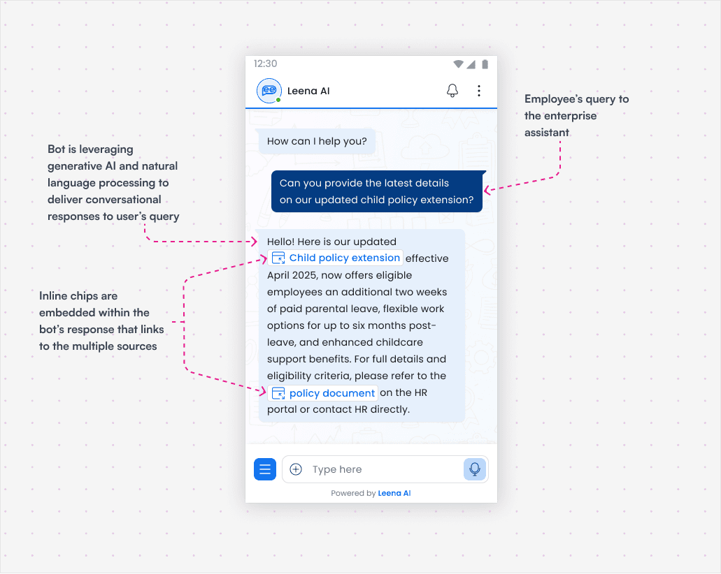
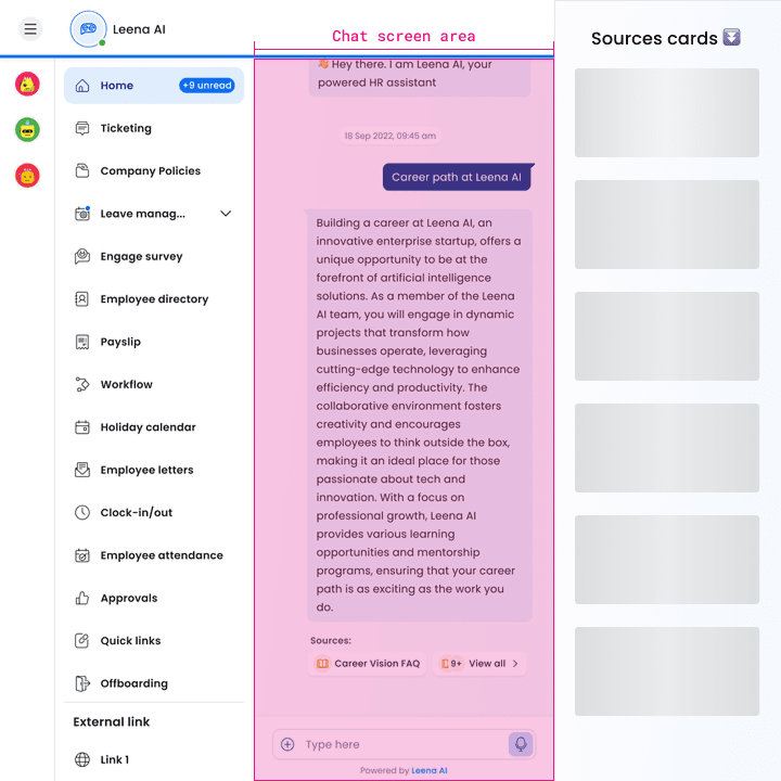
The virtual assistant (bot-driven) leverages generative AI and natural language processing to deliver conversational responses, enabling employees to access critical company-wide information.
However, LLMs are not always perfect, and employees needed a way to cross-check the answers without disrupting their workflow. The existing chatbot interface offered answers but lacked an efficient way to verify bot responses.
Short-term fix
When we first had the requirement to show article links within the bot response, we had taken a design decision to introduce inline chips - clickable source links embedded directly within the bot’s text.
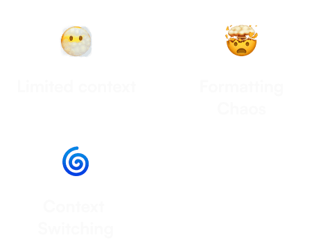
This quick implementation provided immediate visibility into sources, reassuring users that information were grounded in real policies. However, for complex responses requiring multiple citations, inline chips overwhelmed the interface, turning concise answers into a chaotic string of links. Users faced fragmented readability, especially on mobile, and the design lacked space to prioritize high-impact sources.
Though inline chips were effective for simple use cases, the inability to gracefully handle dense sourcing revealed the need for a more structured, scalable solution.
Problem statement
Employees often faced difficulties validating bot-generated responses. This caused frustration, as it was time-consuming to search for sources and articles elsewhere. Without an efficient means of validating responses, employees were uncertain whether the data provided was credible, leading to potential errors and follow-up queries for clarification.
Employees found the existing design challenging - it only allowed for showing limited sources via inline chips. Adding chips to responsive bot bubbles created chaos. They constantly toggled between bot responses and sources, which increased cognitive load and caused frustration.
How can build employee trust by ensuring LLM-generated responses are better sourced, accurate, and easily accessible?
Research & Insights
As part of my initial phase, I conducted a UX audit to identify critical pain points - user flows, manual data-entry bottlenecks, and fragmented source visibility.
To inform our approach to source attribution, I analyzed how leading AI platforms -ChatGPT, Perplexity, Grok, & Google Gemini handle source visibility.

ChatGPT displays a simple sources button which, when clicked, reveals the sources in a list format under a side sheet.
Perplexity shows above section to show source cards and expand those through overlay sidebar that blurs the chat window, balancing focus with accessibility, though it disrupts context.
Grok shows sources in a tabbed format, separating between X posts and web pages, offering a visual distinction between different types of sources.
Google Gemini highlights sources in footnotes, favouring scalability for dense information.
These platforms highlighted few insights:
Context Preservation: Perplexity’s overlay inspires non-destructive design, keeping the chat visible but dimmed.
Scalability vs. Clarity: Gemini’s collapsible footnotes revealed the need for expandable sections to handle 8+ sources without clutter.
User Control: Grok's subtle citations emphasized letting users choose when to dive deeper, avoiding forced interruptions.
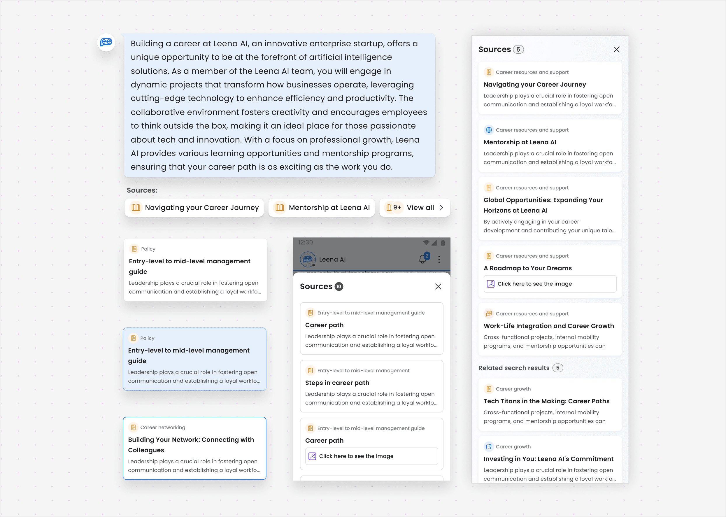
By blending these insights, and staying focussed on our goal, we ideated a contextual sidesheet that surfaces sources on-demand, prioritizes scannability, and adapts to diverse content types - ensuring trust without compromising usability.

User needs
My desk research and discussions with stakeholders, existing customers highlighted several key user needs.
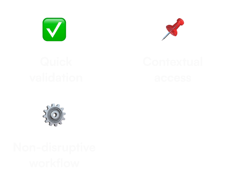
Quick validation: Employees needed a simple way to validate LLM responses.
Non-disruptive workflow: Employees needed the source verification process to be seamless, without interrupting their ongoing tasks.
Contextual access: Employees wanted sources to be easily accessible within the chat interface, rather than requiring navigation away from it.
Ideation & Design
Concept development
I began with sketches and wireframes, focusing on how to incorporate source cards seamlessly into the chat interface.
I defined flows for both web and mobile, ensuring that the citation cards were accessible without overwhelming the primary response area.
The overlay approach, drawn from Perplexity’s design, initially appeared promising. Its core strength lies in minimizing visual noise and directing undivided attention to the source list.

Refinement - Iteration 2
Stakeholder discussions, informed by prior user preference and historical use cases, drove the decision to abandon overlays. Central to the debate was the necessity for simultaneous visibility of responses and sources - existing workflows revealed that users relied on cross-referencing information when referring multiple source.
Thus, removing overlay layer that kept responses and sources side-by-side made more sense.
In the next iteration, I explored around showcasing web articles container in a light box kind of interface and give the user the freedom to navigate between different sources.
More refinement - Iteration 3
A design review call with stakeholders, mainly the engineering lead, revealed some technical challenges. The challenges were refactoring our webview system to support iframe-based article loading. Restructuring how webviews were rendered - originally designed to load into chat window - exceeded the project’s timeline, forcing us to pivot toward simpler, non-disruptive sourcing solutions.
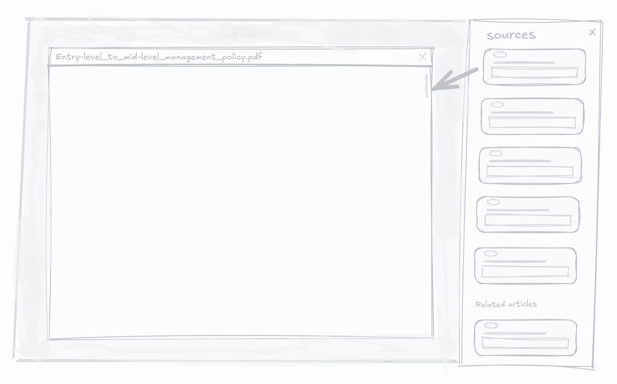
In this next iteration, the focus shifted towards integrating source material directly within the chat interface. This approach aims to allow users to seamlessly switch between different sources without losing context or flow.

One more addition - Related search results
One of the feedback was around adding relevant search articles that are published based on the policy, FAQs and SOPs data
Enterprise knowledge often contains duplicated or overlapping information. The goal of displaying related search results was to enhance transparency for employees regarding the article response while also improving navigation.
This ensures employees can easily access relevant content if the LLM response appears in a related article.
Critical juncture
The Responsive Design Dilemma
Initially, the 3-column layout (left panel, chat area, sources) seemed ideal - users could cross-reference sources without losing context.
However, on devices with 768px–1024px widths, the layout collapsed into a cramped mess. This led to a chaotic user experience where readability and interaction were compromised.
After presenting an example screen to stakeholders, it became evident that the design was not scaling well for narrower screens. The feedback session highlighted the perils of a shrinking section, leading us back to the drawing board to re-evaluate our approach.
Breaking the Deadlock: Adaptive Grids
After thorough discussion, we decided to explore alternatives. I proposed revisiting the layout for specific screen sizes, focusing on devices with widths between 960px and 1199px, where the three-column layout was particularly problematic.
To solve this, I proposed hiding the left panel on opening of the sidesheet, in order to accomodate the article view. This was not flagged "bad UX" at first, but after doing a quick round of usability testing, the feedback helped me convince stakeholders and we were through this rough patch of critical juncture
Next, we settled on a two-column layout for this range, and mapped out layout style for different screen sizes as detailed in the table below:

Final design &
Implementation
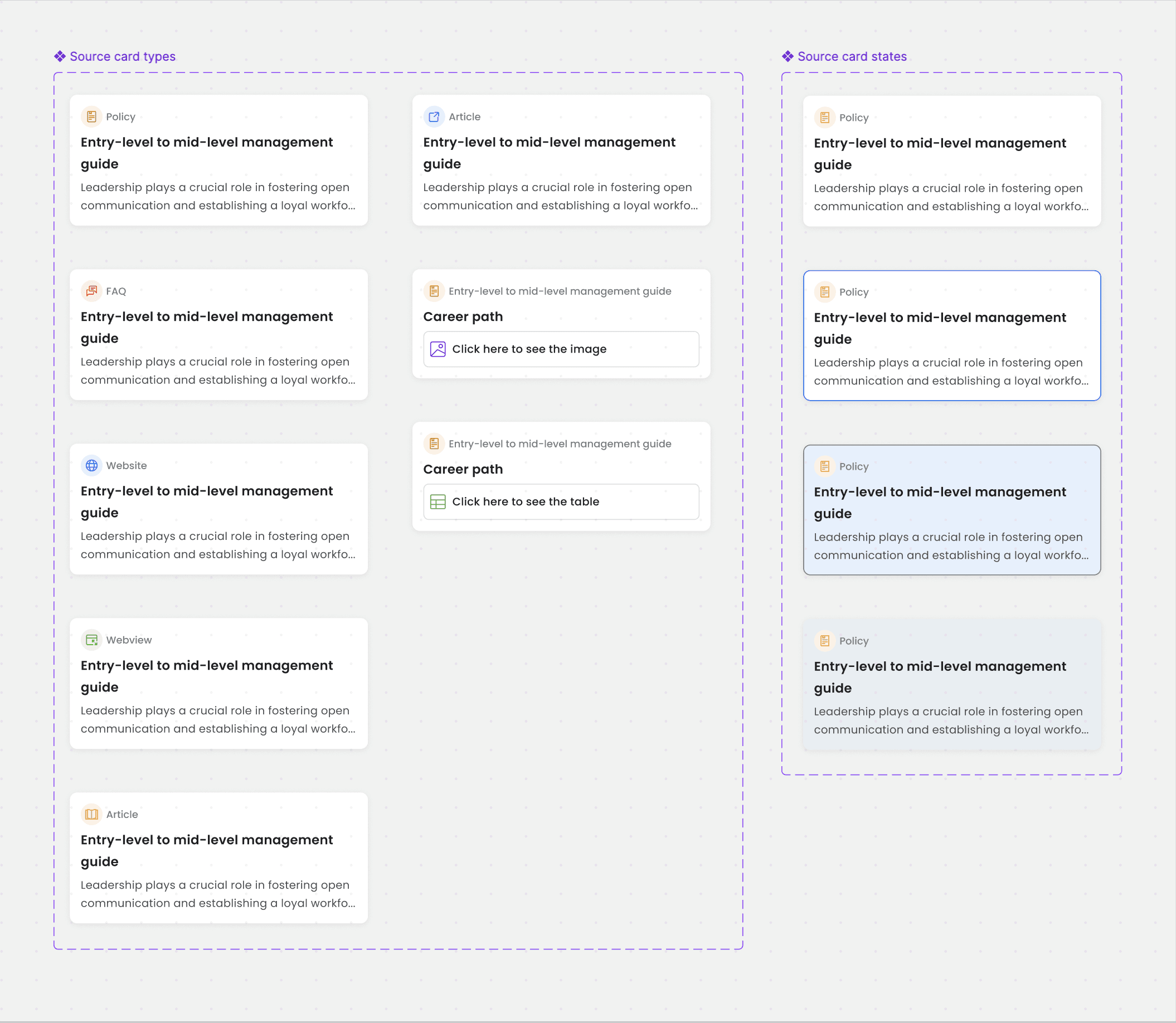
Source cards
To ensure consistency across AI pipeline references, I standardized structure of source cards which will go into Sources sidesheet, aligning their visual language.
Example - layout, title hierarchy, spacing etc.Iterations 1 to 3 progressively introduce elements like icons to improve content clarity, with each iteration refining the balance between simplicity & added detail.
The final iteration 4 excels in clarity, simplicity, and effective visual hierarchy, making content easily identifiable and readable
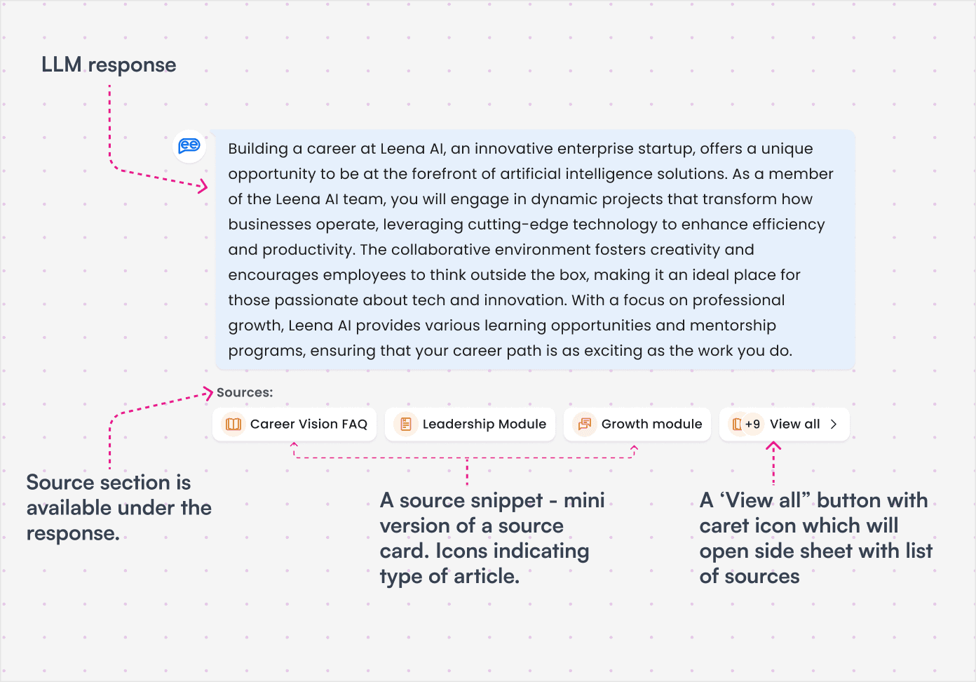
Source snippets
To give some idea on the availability of sources under the LLM response, I needed to design the snippets of these sources. In first few iterations, I explored the lengths of snippets, the main goal was to keep it compact and space-efficient. The idea was to to give users an indication of source chips which will make it easier to scan and identify key sources quickly.
The compact format ensures primary information remains prominent while secondary content stays accessible.
Next steps
Post-Launch monitoring: Analyze user interactions with the source cards to identify any areas for further optimization.
Iterative improvements: Use user feedback and analytics to refine the design continuously.
Broader rollout: Explore expanding adding source model to other AI-powered features on different agents.